
Go back
Public transport and mobility app
challenge
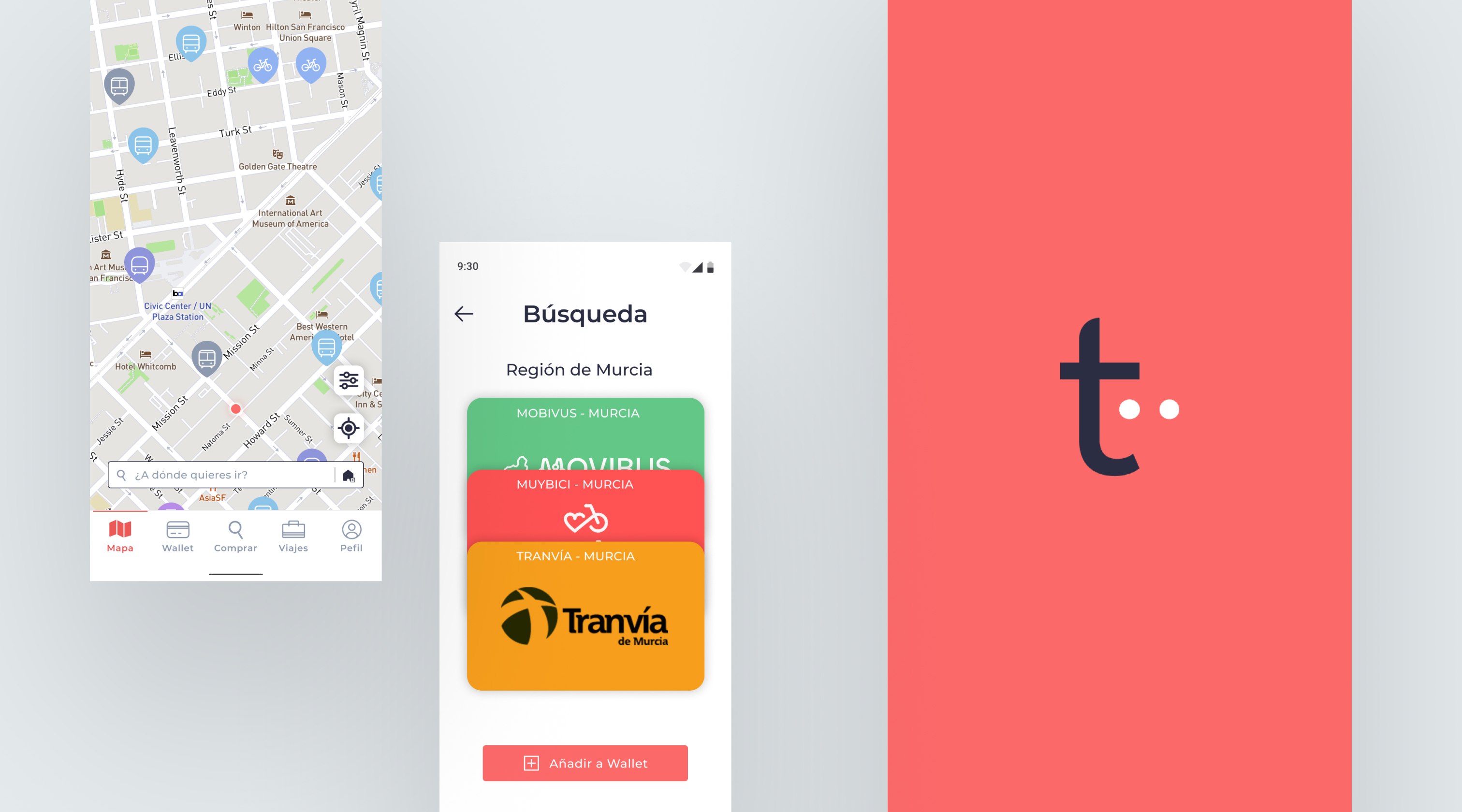
Tändem es una app móvil de transporte público que busca simplificar la experiencia de viaje en España. El proyecto gira en torno a la mejora de la experiencia de usuario en las apps de servicios de transporte, unificando en un solo lugar la planificación de rutas, la información en tiempo real y la gestión de títulos de transporte.pistudio+1
El reto principal era diseñar una solución accesible, clara y sostenible que redujera la fricción en el uso del transporte público y ofreciera una experiencia integrada frente a la fragmentación actual entre distintas apps, webs y tarjetas físicas.pistudio+1
The challenge was to design an experience that unified access to public transport services, allowing users to check routes, purchase tickets, and manage cards from a single app, adapted to different user profiles and travel contexts.
role
End-to-end UX/UI designer: research, information architecture, flows, interface design in Figma, prototyping, and usability evaluation.
process
1. Research
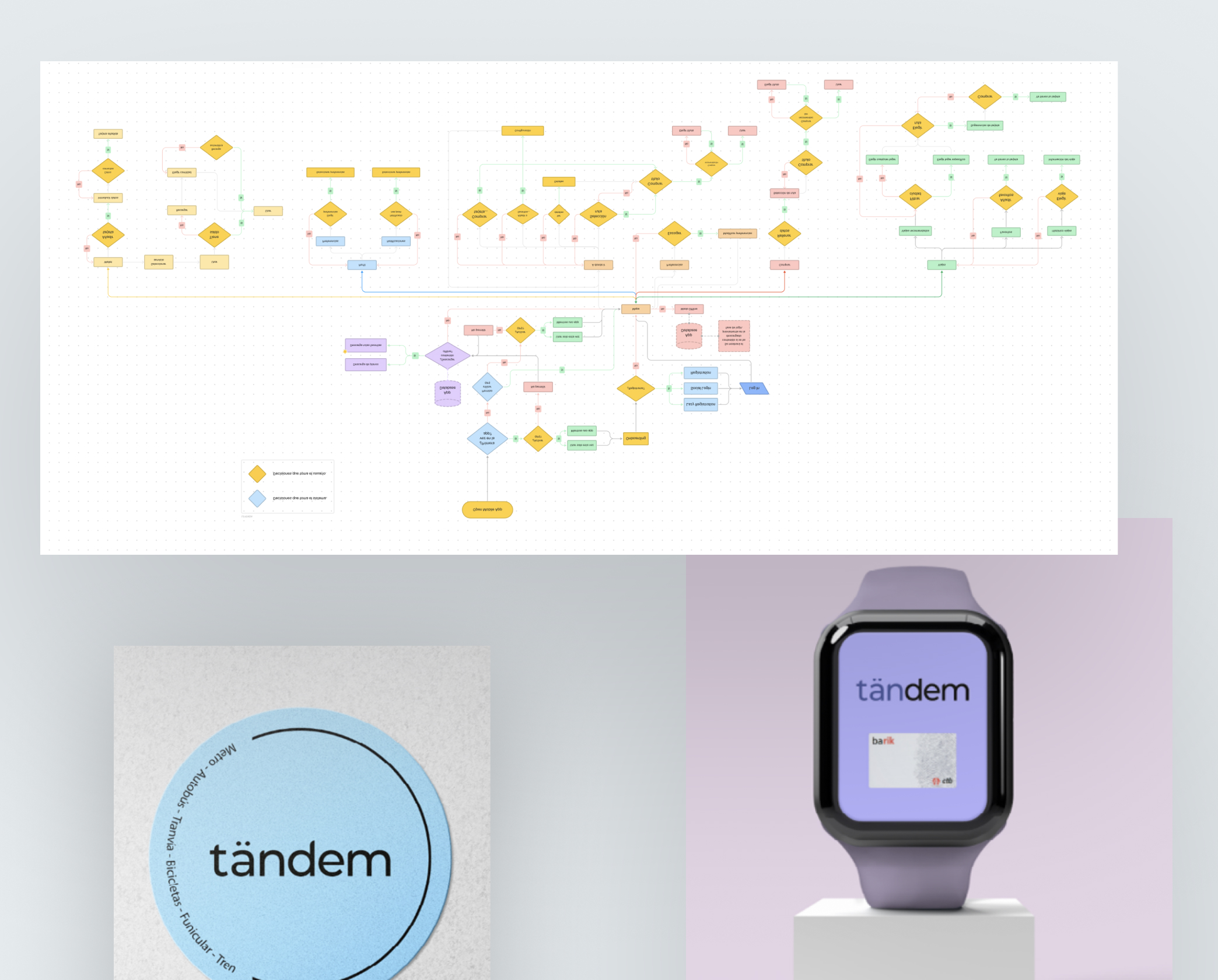
We analyzed the public transport ecosystem in Spain, identifying 86 different transport cards and ticket types. The research was completed with a benchmark of mobility apps, immersion in different contexts, interviews, surveys, and the definition of three archetypes: tourist, resident, and user with functional diversity.
2. Architecture and proposal
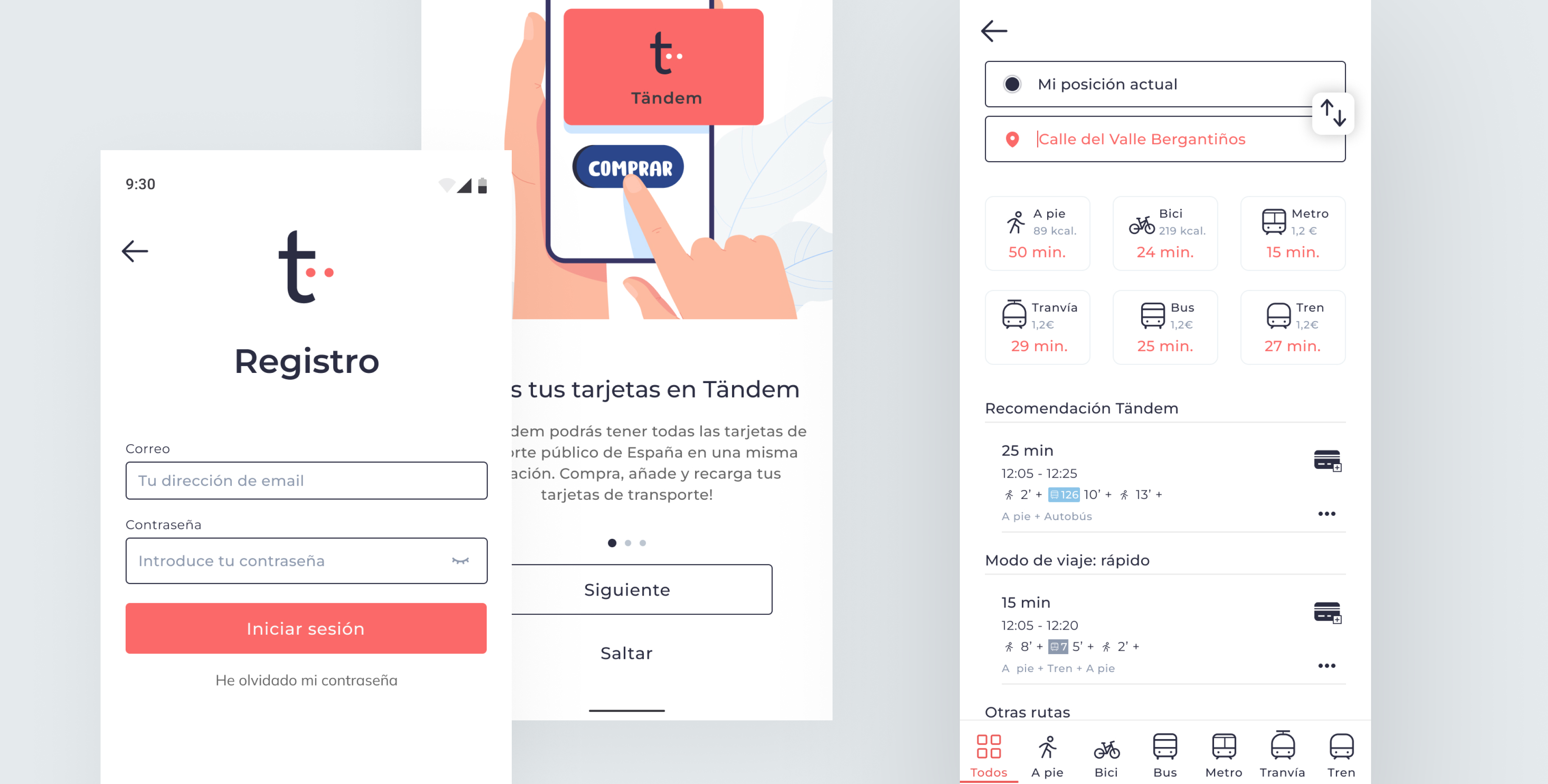
Based on the insights gathered, we defined the main flows and features: map, trips, purchase, wallet, and profile. The architecture allows users to choose between fast, cheap, or sustainable routes, and to filter by transport mode, accessibility, occupancy, or walking distance.
3. Prototyping and evaluation
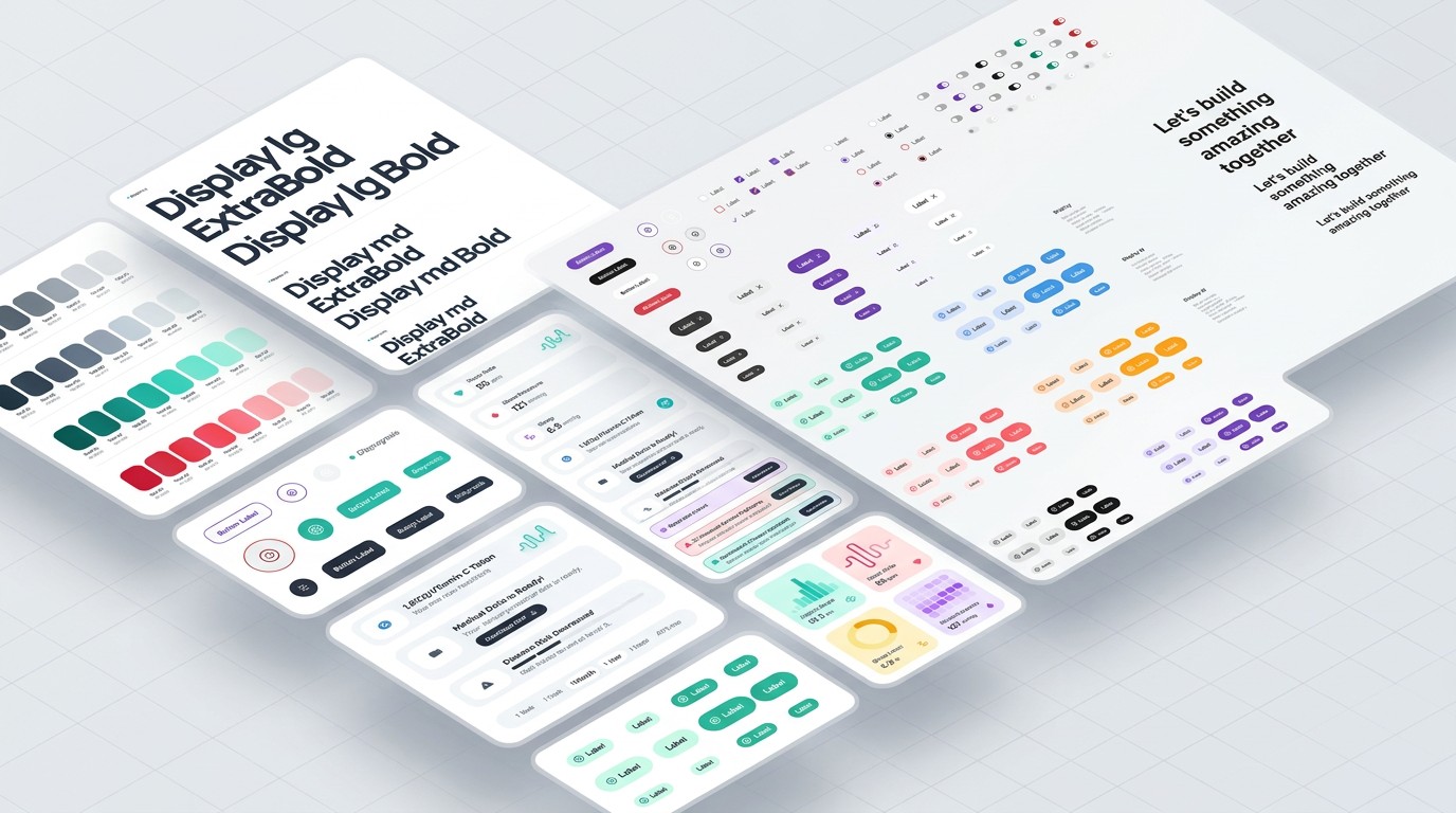
We developed sketches, wireframes, and a high-fidelity prototype in Figma, supported by a design system and reusable components. The prototype was evaluated through a usability test with five participants, uncovering issues with map navigation, icon comprehension, visibility of primary actions, and discoverability of preferences. Based on these findings, we revised the copy, CTAs, component states, and interaction flows.
key design decisions
- Unified wallet: all transport cards and tickets are stored in a single digital wallet, removing the need to carry physical cards or use multiple apps.
- Adapted recommendations: the system suggests routes and tickets based on time, price, sustainability, accessibility, and occupancy, allowing users to prioritize according to their needs.
- Travel preferences: a profile screen where users configure their preferred transport modes, accessibility filters, service saturation, and walking times.
- Iterative flows: screens and primary actions were repositioned after the usability test to improve visibility, reduce cognitive load, and make purchasing and managing tickets easier.
outcome & learnings
El trabajo dejó una base de producto para continuar con el desarrollo del módulo, conectando necesidades de usuario, permisos, estados y arquitectura de información.
Este proyecto reforzó la importancia de no diseñar un HRM como una única ficha llena de datos: la claridad depende de priorizar información, controlar el acceso y adaptar cada experiencia a la persona que la utiliza.
The system allows recommendations to be adapted to each person’s priorities and reduces the uncertainty associated with traveling in an unfamiliar city or region.
Learnings
- The fragmentation of public transport is a complex service problem that requires in-depth research before designing.
- Validating flows with real users is key when the app must be used in situations involving movement, waiting, or potential stress.
- Clarity in copy, icons, and component states can make the difference between a fluid and a confusing experience.
As next steps, the plan is to evolve the prototype into an MVP, expand testing to different cities, and explore integration with NFC technologies, wearables, and other mobility services.
more projects

Go back
Public transport and mobility app
challenge
Public transport in Spain is fragmented across different regions, operators, and payment systems. Users have to manage multiple cards, apps, and information channels depending on the city they are in, which leads to confusion, unnecessary waiting, and a less fluid travel experience.
The challenge was to design an experience that unified access to public transport services, allowing users to check routes, purchase tickets, and manage cards from a single app, adapted to different user profiles and travel contexts.
role
End-to-end UX/UI designer: research, information architecture, flows, interface design in Figma, prototyping, and usability evaluation.
process
1. Research
We analyzed the public transport ecosystem in Spain, identifying 86 different transport cards and ticket types. The research was completed with a benchmark of mobility apps, immersion in different contexts, interviews, surveys, and the definition of three archetypes: tourist, resident, and user with functional diversity.
2. Architecture and proposal
Based on the insights gathered, we defined the main flows and features: map, trips, purchase, wallet, and profile. The architecture allows users to choose between fast, cheap, or sustainable routes, and to filter by transport mode, accessibility, occupancy, or walking distance.
3. Prototyping and evaluation
We developed sketches, wireframes, and a high-fidelity prototype in Figma, supported by a design system and reusable components. The prototype was evaluated through a usability test with five participants, uncovering issues with map navigation, icon comprehension, visibility of primary actions, and discoverability of preferences. Based on these findings, we revised the copy, CTAs, component states, and interaction flows.
key design decisions
- Unified wallet: all transport cards and tickets are stored in a single digital wallet, removing the need to carry physical cards or use multiple apps.
- Adapted recommendations: the system suggests routes and tickets based on time, price, sustainability, accessibility, and occupancy, allowing users to prioritize according to their needs.
- Travel preferences: a profile screen where users configure their preferred transport modes, accessibility filters, service saturation, and walking times.
- Iterative flows: screens and primary actions were repositioned after the usability test to improve visibility, reduce cognitive load, and make purchasing and managing tickets easier.
outcome & learnings
El trabajo dejó una base de producto para continuar con el desarrollo del módulo, conectando necesidades de usuario, permisos, estados y arquitectura de información.
Este proyecto reforzó la importancia de no diseñar un HRM como una única ficha llena de datos: la claridad depende de priorizar información, controlar el acceso y adaptar cada experiencia a la persona que la utiliza.
The system allows recommendations to be adapted to each person’s priorities and reduces the uncertainty associated with traveling in an unfamiliar city or region.
Learnings
- The fragmentation of public transport is a complex service problem that requires in-depth research before designing.
- Validating flows with real users is key when the app must be used in situations involving movement, waiting, or potential stress.
- Clarity in copy, icons, and component states can make the difference between a fluid and a confusing experience.
As next steps, the plan is to evolve the prototype into an MVP, expand testing to different cities, and explore integration with NFC technologies, wearables, and other mobility services.
more projects

Go back
Public transport and mobility app
challenge
Public transport in Spain is fragmented across different regions, operators, and payment systems. Users have to manage multiple cards, apps, and information channels depending on the city they are in, which leads to confusion, unnecessary waiting, and a less fluid travel experience.
The challenge was to design an experience that unified access to public transport services, allowing users to check routes, purchase tickets, and manage cards from a single app, adapted to different user profiles and travel contexts.
role
End-to-end UX/UI designer: research, information architecture, flows, interface design in Figma, prototyping, and usability evaluation.
process
1. Research
We analyzed the public transport ecosystem in Spain, identifying 86 different transport cards and ticket types. The research was completed with a benchmark of mobility apps, immersion in different contexts, interviews, surveys, and the definition of three archetypes: tourist, resident, and user with functional diversity.
2. Architecture and proposal
Based on the insights gathered, we defined the main flows and features: map, trips, purchase, wallet, and profile. The architecture allows users to choose between fast, cheap, or sustainable routes, and to filter by transport mode, accessibility, occupancy, or walking distance.
3. Prototyping and evaluation
We developed sketches, wireframes, and a high-fidelity prototype in Figma, supported by a design system and reusable components. The prototype was evaluated through a usability test with five participants, uncovering issues with map navigation, icon comprehension, visibility of primary actions, and discoverability of preferences. Based on these findings, we revised the copy, CTAs, component states, and interaction flows.
key design decisions
- Unified wallet: all transport cards and tickets are stored in a single digital wallet, removing the need to carry physical cards or use multiple apps.
- Adapted recommendations: the system suggests routes and tickets based on time, price, sustainability, accessibility, and occupancy, allowing users to prioritize according to their needs.
- Travel preferences: a profile screen where users configure their preferred transport modes, accessibility filters, service saturation, and walking times.
- Iterative flows: screens and primary actions were repositioned after the usability test to improve visibility, reduce cognitive load, and make purchasing and managing tickets easier.
outcome & learnings
Tändem is conceived as a more unified and personalized public transport experience. The proposal brings journey planning, information lookup, ticket purchase, and card management together in a single app.
The system allows recommendations to be adapted to each person’s priorities and reduces the uncertainty associated with traveling in an unfamiliar city or region.
Learnings
- The fragmentation of public transport is a complex service problem that requires in-depth research before designing.
- Validating flows with real users is key when the app must be used in situations involving movement, waiting, or potential stress.
- Clarity in copy, icons, and component states can make the difference between a fluid and a confusing experience.
As next steps, the plan is to evolve the prototype into an MVP, expand testing to different cities, and explore integration with NFC technologies, wearables, and other mobility services.
more projects