
Go back
Rita 2.0. - Design System
challenge
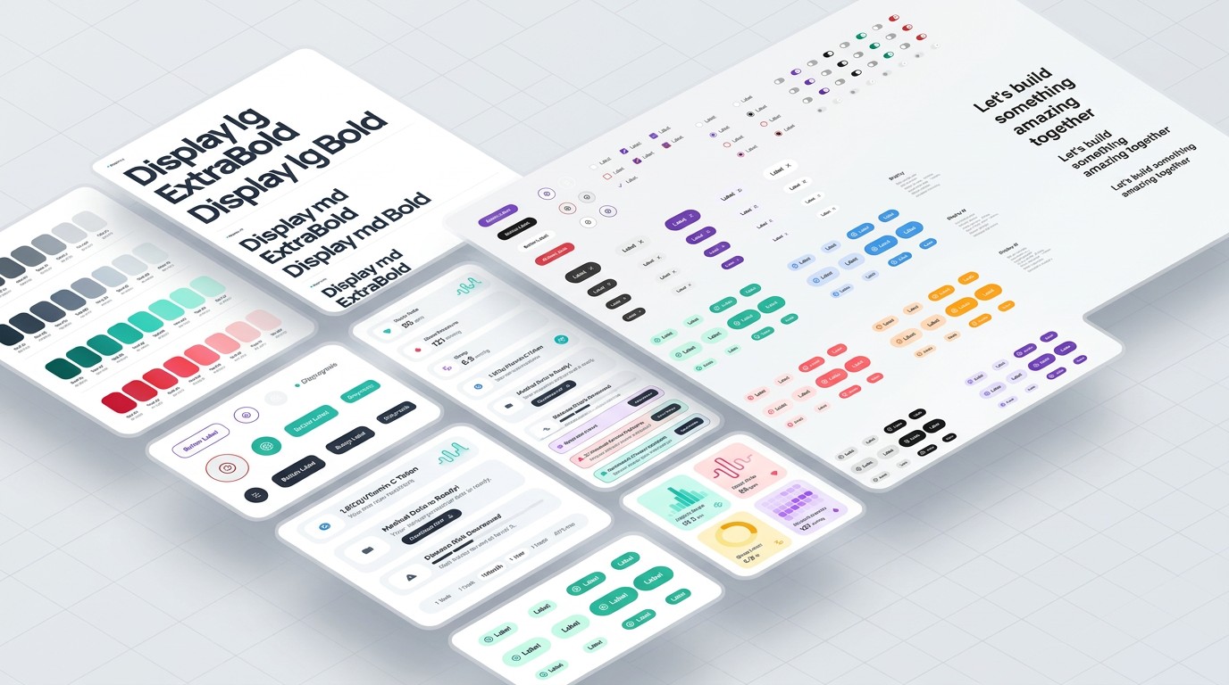
The previous design system was outdated, hard to reuse, and each team had ended up creating its own libraries. This led to inconsistencies across products and made it difficult for development to rely on a shared foundation.
The goal was to build a new visual foundation for internal products, differentiated from external references and ready to adapt to interfaces with different needs.
role
I worked as a UX/UI & Product Designer within the design team, collaborating with other designers and developers to ensure the components were reusable in real products.
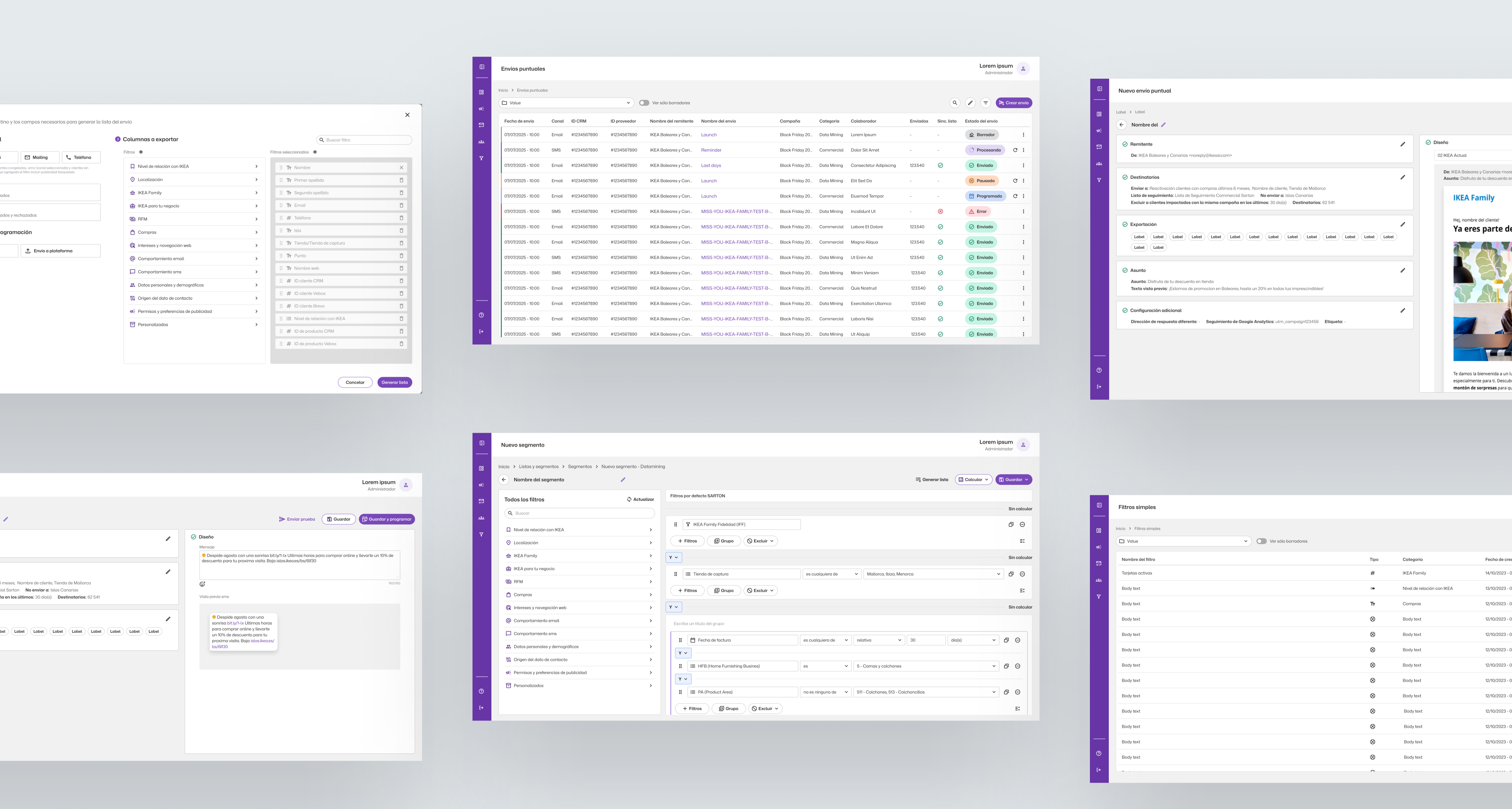
During the development of CRM Marketing, I took a particularly active role in evolving the system and applying it in practice.
process
- We reviewed best practices, Figma features, and established systems such as Material Design, Atlassian, and Salesforce.
- We defined foundations, scales, typography, color, and component rules before extending the library.
- Components were tested directly in real products to identify scalability, accessibility, and consistency needs.
key design decisions
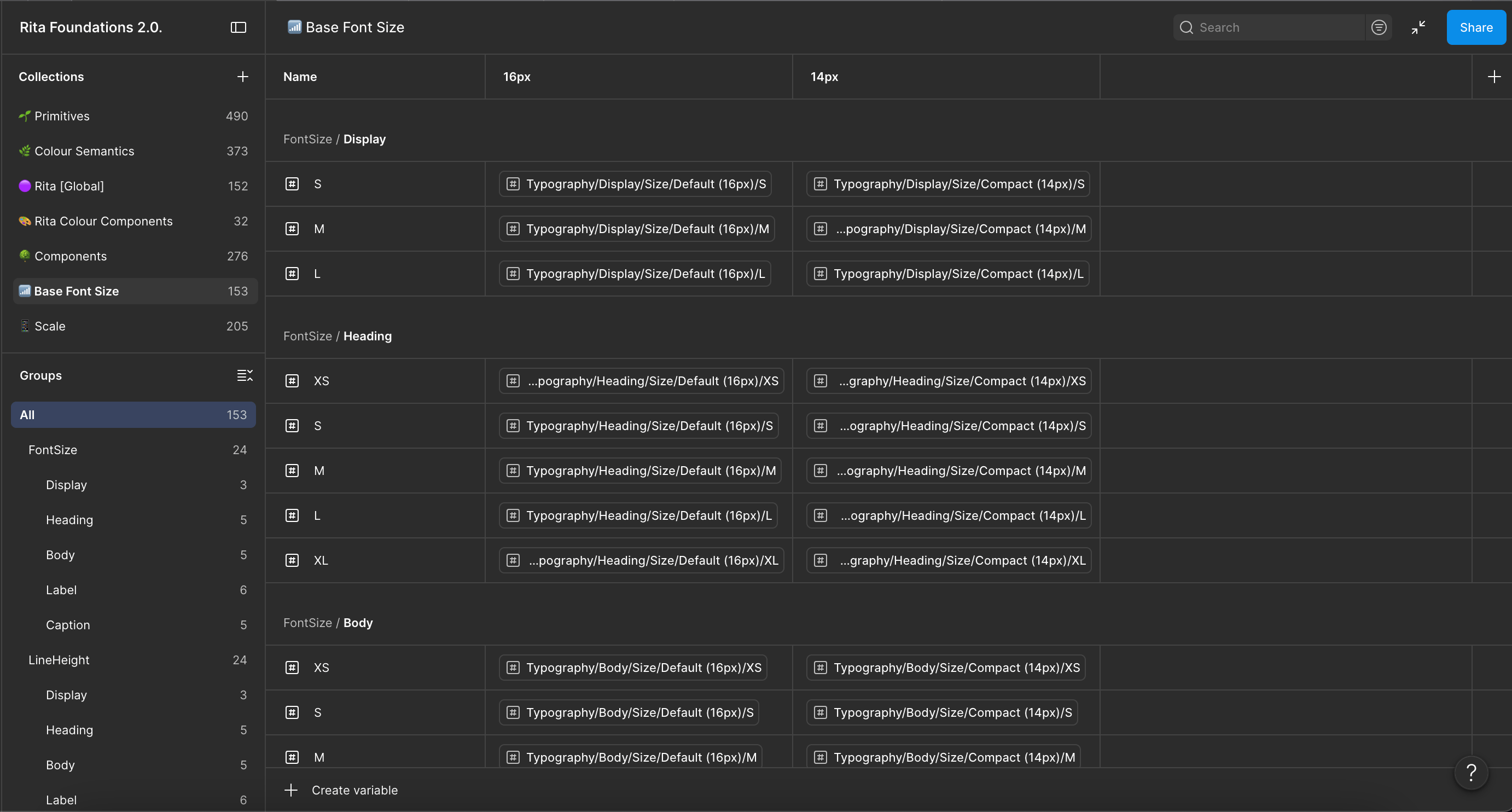
- Two type bases.We defined 14px configurations for dense interfaces, such as a CRM, and 16px for web experiences with more space.
- Connected variables.Collections like Scale, Primitives, Base Font Size, Colour Semantics, and Rita Colour were linked to adapt the look and feel of each product without starting from scratch.
- System ready to grow.Foundations, Components, Assets, and Icons were organized to incorporate new elements and variants as products required.
outcome & learnings
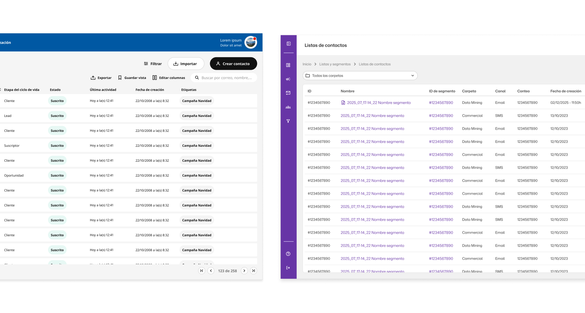
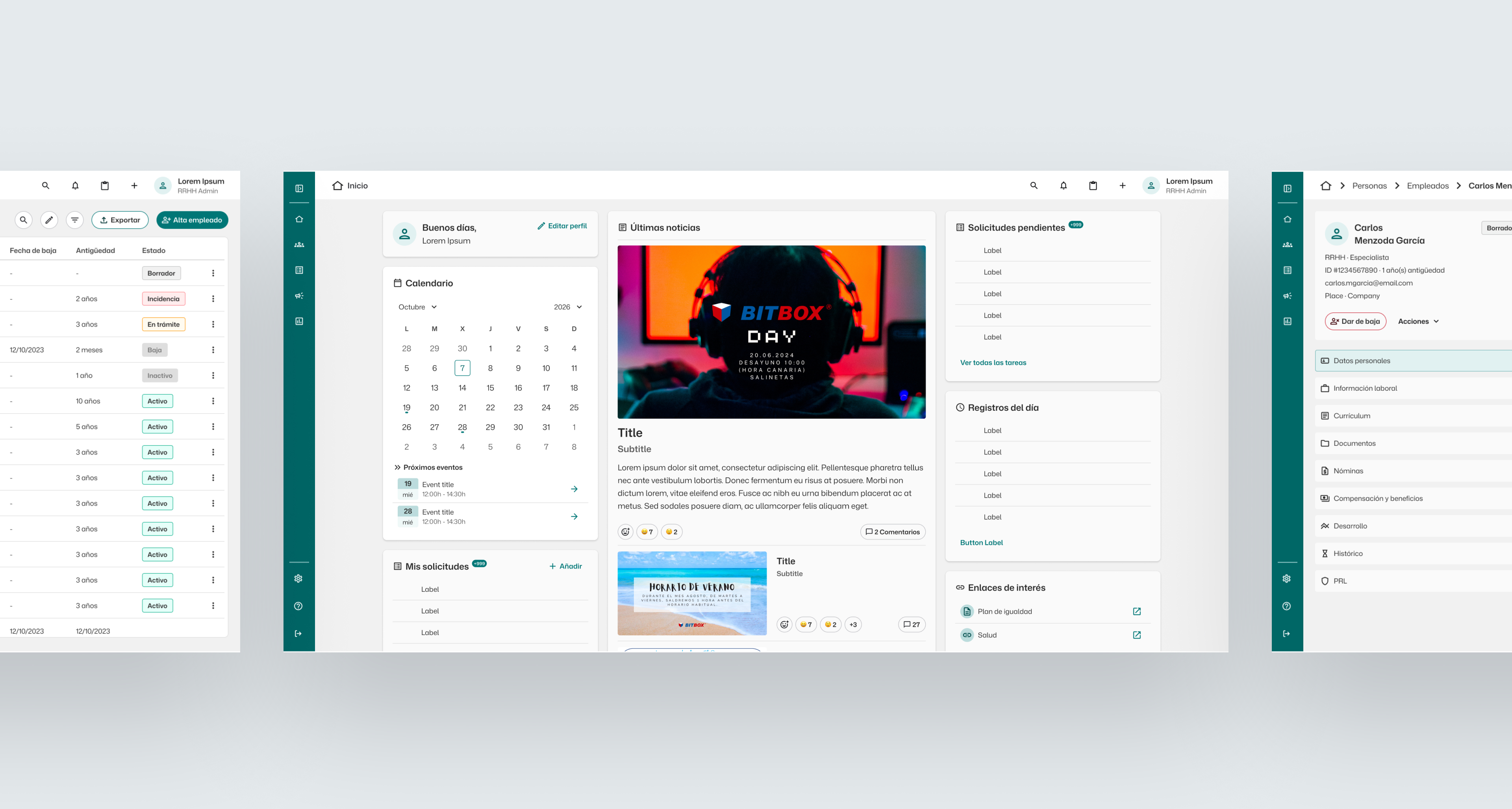
Rita 2.0 made it possible to build more accurate mockups and templates using shared components, reducing time spent on repetitive UI decisions and creating a more coherent visual language across products.
Although there wasn’t time to complete all the documentation or the mobile version, the work confirmed the value of building solid foundations: the initial effort allows design and development to move forward with better alignment and speed in the long term.
more projects


Go back
Rita 2.0. - Design System
challenge
The previous design system was outdated, hard to reuse, and each team had ended up creating its own libraries. This led to inconsistencies across products and made it difficult for development to rely on a shared foundation.
The goal was to build a new visual foundation for internal products, differentiated from external references and ready to adapt to interfaces with different needs.
role
I worked as a UX/UI & Product Designer within the design team, collaborating with other designers and developers to ensure the components were reusable in real products.
During the development of CRM Marketing, I took a particularly active role in evolving the system and applying it in practice.
process
- We reviewed best practices, Figma features, and established systems such as Material Design, Atlassian, and Salesforce.
- We defined foundations, scales, typography, color, and component rules before extending the library.
- Components were tested directly in real products to identify scalability, accessibility, and consistency needs.
key design decisions
- Two type bases.We defined 14px configurations for dense interfaces, such as a CRM, and 16px for web experiences with more space.
- Connected variables.Collections like Scale, Primitives, Base Font Size, Colour Semantics, and Rita Colour were linked to adapt the look and feel of each product without starting from scratch.
- System ready to grow.Foundations, Components, Assets, and Icons were organized to incorporate new elements and variants as products required.
outcome & learnings
Rita 2.0 made it possible to build more accurate mockups and templates using shared components, reducing time spent on repetitive UI decisions and creating a more coherent visual language across products.
Although there wasn’t time to complete all the documentation or the mobile version, the work confirmed the value of building solid foundations: the initial effort allows design and development to move forward with better alignment and speed in the long term.
more projects

Go back
Rita 2.0. - Design System
challenge
The previous design system was outdated, hard to reuse, and each team had ended up creating its own libraries. This led to inconsistencies across products and made it difficult for development to rely on a shared foundation.
The goal was to build a new visual foundation for internal products, differentiated from external references and ready to adapt to interfaces with different needs.
role
I worked as a UX/UI & Product Designer within the design team, collaborating with other designers and developers to ensure the components were reusable in real products.
During the development of CRM Marketing, I took a particularly active role in evolving the system and applying it in practice.
process
- We reviewed best practices, Figma features, and established systems such as Material Design, Atlassian, and Salesforce.
- We defined foundations, scales, typography, color, and component rules before extending the library.
- Components were tested directly in real products to identify scalability, accessibility, and consistency needs.
key design decisions
- Two type bases.We defined 14px configurations for dense interfaces, such as a CRM, and 16px for web experiences with more space.
- Connected variables.Collections like Scale, Primitives, Base Font Size, Colour Semantics, and Rita Colour were linked to adapt the look and feel of each product without starting from scratch.
- System ready to grow.Foundations, Components, Assets, and Icons were organized to incorporate new elements and variants as products required.
outcome & learnings
Rita 2.0 made it possible to build more accurate mockups and templates using shared components, reducing time spent on repetitive UI decisions and creating a more coherent visual language across products.
Although there wasn’t time to complete all the documentation or the mobile version, the work confirmed the value of building solid foundations: the initial effort allows design and development to move forward with better alignment and speed in the long term.
more projects